Department of Interior

The Challenge
In this project, I worked in a group.
Learning to speak up with my ideas and deliver my message respectfully and clearly were my biggest challenge.
The Problem
The Solution
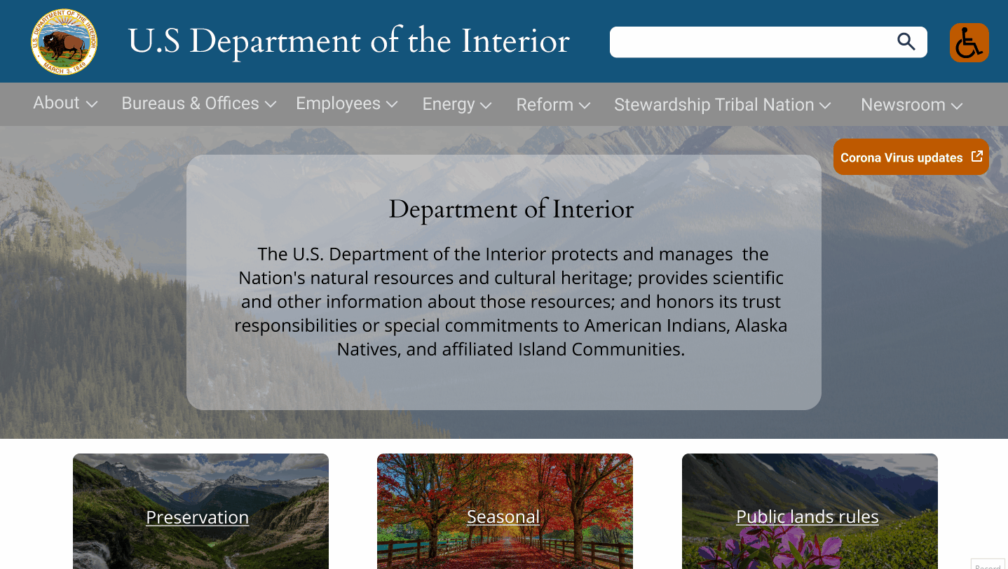
Improve the usability and image of the U.S. Department of Interior website by creating a responsive.
Redesign the website through heuristic analysis and integration of new UI components.
My Role
User Researcher, UX Designer, Visual UI Designer.
Tools Used
Figma, Invision, Trello, Zoom, Google Meet,
Design Process
The creation of "Luis Kai" was the first step to help keep in perspective what was important. Immediately we saw the frustrations new employees may get when trying to log in to the website.
After some more digging the findings where shocking. The look of the website was great, the accessibility tools were open-minded, but the basic usability was lost. Many links were hidden, and others jumped to a different website without warning, making the navigation difficult and confusing.
Heuristic Website Analysis
Usability Heuristics are guides created by Jakob Nielsen to help improve and facilitate usability on the web. They are strategic points in design to help people solve problems and intuitively make decisions quickly and efficiently.


The purpose of the carousel is defeated by the overlaid video that hides links.
After evaluating the website, the most natural step was to test the navigation in a series of tasks performed for a third party person.
The finding in this test was clear and on point. The navigation system in this website needed a rework. Even though their website was modern and applied design rules in a generous way, important links were hidden in the carousel, and other links were placed in the wrong menu.
Alterations Based on Testing
The hidden links in the carousel were exposed in their own display buttons.

The menu was tested and reworked in two occations to improve navigation.

Original
5 menus
First try-
9 menus
Second try-
7 menus
Style Guide
The creation of the style guide was a combination of preserving what was working in the website and integration of missing elements and icons to elevate the experience for the user and ensure accessibility, readability, and navigability.


Final test
We observed an improvement in task execution, as users were able to perform faster and more efficiently.

Final Product
The challenge of this exercise was to provide a design that was responsive and adaptable to different screen sizes.
I believe this objective has been conquered and the improvements are satisfactory.