
Pause

The Challenge
The Problem
The Solution
My Role
Anxiety and stress are common states of mind in our society. It has become so common that some people do not realize they are affected, especially teenagers.
Guidance and tools are needed to confront negative thoughts and self-image. "Pause" is a web design to unplug the teen from the social pressure and help them develop mindfulness.
User Researcher, UX Designer, Visual UI Designer, Interaction Designer.
The User
The website is designed to be used for pre-teens and teenagers that daily are facing pressure in the form of expectations from parents, friends, and teachers. We target this particular time in life because we found out that they were an ignored population; all the apps for relaxation or mindfulness were targeted at adults or small children.
Sadly, teenagers are the highest consumers of social media and they feel insecure when comparing themselves to the "perfect lives" shown in different media. And they are easily influenced to believe that is how they should live their lives. They are desperate to find their place in this world and want to feel accepted. Their life balance is extremely delicate because school, friends, and family are pulling in different directions.


The Research
Many teenagers felt similarly about the stress
and anxiety they feel from social media, and at
school around their peers.
They are most likely to find a quiet place and listen to calming music such as lo-fi when trying to relax.
Favorite apps: TikTok, Snapchat, Instagram,
Pinterest, YouTube.
A few practice meditation/mindfulness regularly.
The competitive analysis reaffirms our first instinct. There are no apps or websites specifically for teenagers. Our competitors offer techniques targeting adults or families with small children. But the teen population is completely ignored.


The Design Process
We brainstormed ideas for a homepage layout and user flow. The goal was to find a flow that was simple to use and help make quick decisions for the users.
When deciding on different features we would like to include, we chose to focus on a selection of music, guided meditation, and videos such as ASMR and “oddly satisfying” videos.
These are two types of videos that relax the brain because of auditory and visual sensations.


Testing
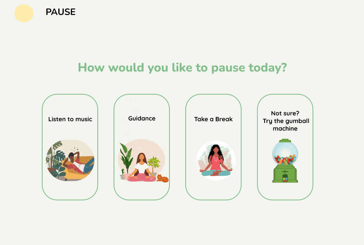
We modified our first prototype and created a mid-fidelity prototype that represents our user flow and focuses the website on four main features:
-
Listen to Music - music selections to help increase focus, relaxation, and productivity
-
Guidance - guided meditations that target user challenges and struggles in their everyday lives
-
Take a Break - offering videos that teens often watch on Youtube or Instagram for relaxation and meditation
-
Gumball Machine - this page would randomly choose an activity for the user, helping the user when they are not sure what to select.
The constructive and helpful user tests of the mid-fidelity prototype ensured we were on the right path. There were a few iterations we needed to make:
-
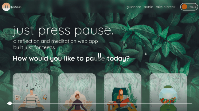
Add a clear logo in the top left corner next to the name of the website to represent the “home” page.
-
Make sure the design stayed consistent with a “mature” teen audience.
Design Decisions
The primary and secondary color schemes that we decided on were black, white, and green. Green represents growth and wellbeing and so we thought that was fitting for a mental health app. We chose earthy warm colors such as teal, salmon pink, and rusty orange as our contrasting colors to give the web app an optimistic feel.
We also used illustrations that go with our earthy color scheme and relate to the theme.
Our design decisions are a reflection of our research and what would be most important for the users to achieve their goals, making sure it was simple and accessible.

Product
The process of coding the website was really educational. Using tools like Bootstrap helped to accelerate the coding process.
The translation from Figma prototype to actual code was a challenge that ended in a good looking website.
The final user testing went great and helped us to understand our audience even further.
The fixes from previous testing gave the final product an excellent standing.

Check out the Github
Pause is the final project in the bootcamp. The challenge was to create an original project showcasing all the knowledge learned in the bootcamp.
